This week, YouTube has let loose the new look desktop site for every user, along with a new modern logo. The company has been testing the new look homepage on users gradually since it was first released back in May of this year, while also gathering feedback.
New. Look.
YouTube is used a lot, around 400 hours worth of video footage is uploaded to the site every minute, of every day. So making a small change to how the site works could cause a few issues.
Google annouced that the video sharing site would receive a makeover back in the early part of May this year, it takes cues from Google’s own material design standards, which involves a flatter design and a refined colour palette.
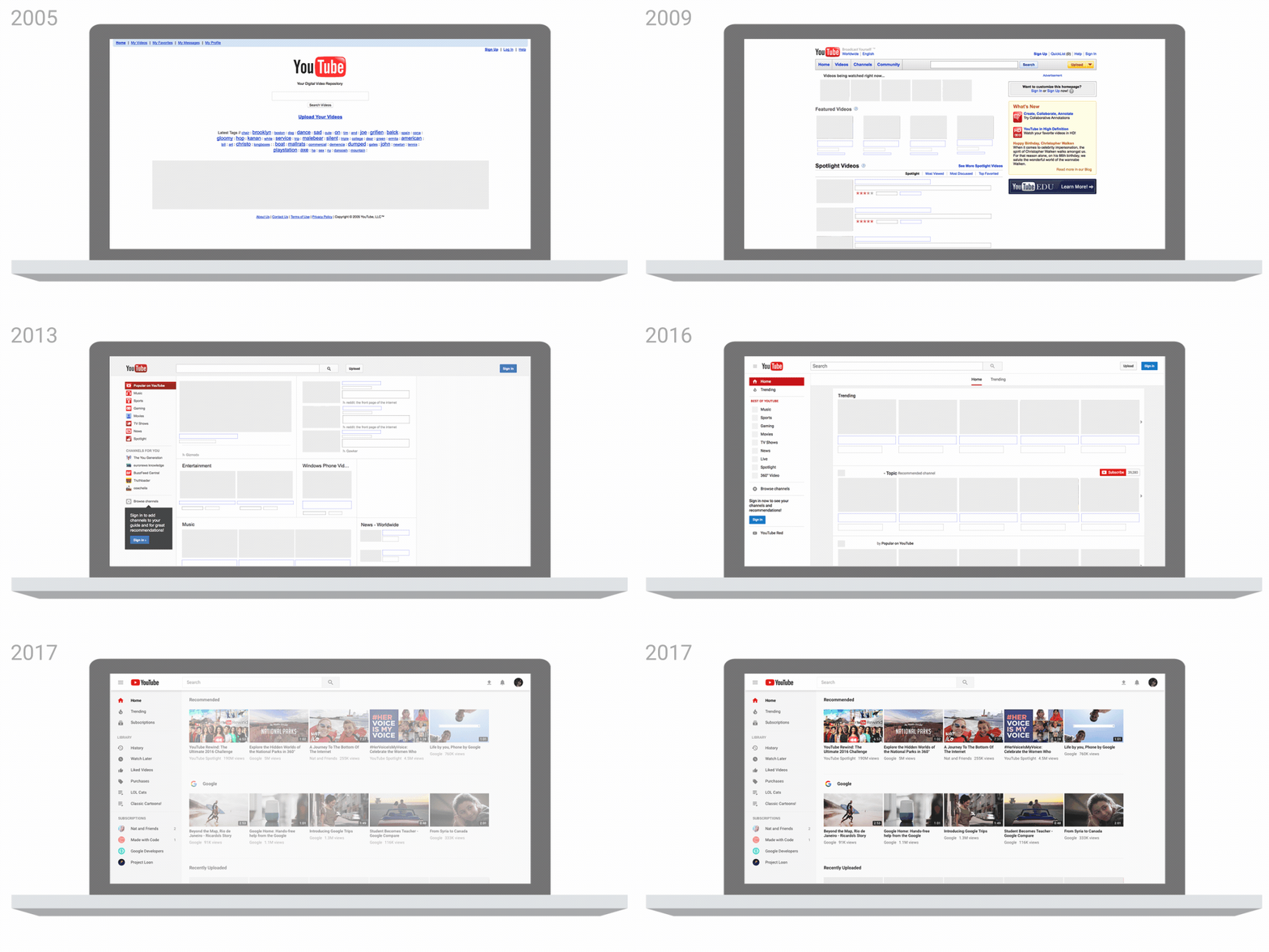
Progression of the YouTube homepage

With the new update, Google hasn’t changed loads – the home page has more breathing room for the highlighted videos and the left menu is collapsable by clicking the hamburger menu. A big request which has been added in is Dark Mode, once enabled all the white elements on the UI turn a very dark grey, which will make late night viewing less strenuous on the eyes.
Mobile changes
YouTube has also released updates for the iOS and Android apps, with the ability now to control playback speed and portrait videos now look better with a new playback window.
Source: YouTube Blog


