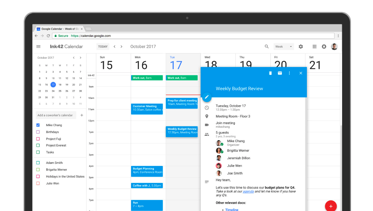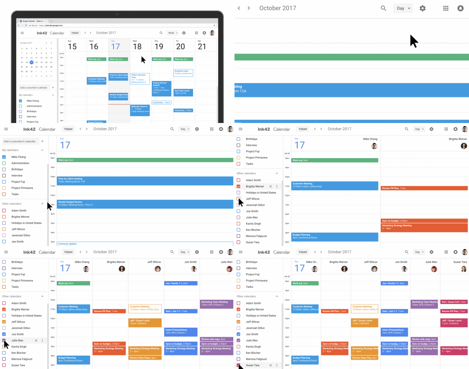
Google Calendar on mobile has long been ahead of its web counterpart for user interface design, but today Google has finally updated the look and feel of the web version. For ages it has had a Google Mail -esque feel about it and looked sort of out of place when comparing it to the more recent of Google’s projects, including Inbox, Maps and also the newer Android releases.
New Look
The new look Google Calendar has an all new design, which closely represents the mobile version on iOS and Android, which makes sense from a usability standpoint.

The web version also has the current colour palette from Material Design as well as now adjusting to the screen size of which you are using, which has been long overdue.
For G Suite users, Google has packed in a few new features. Rich text and hyperlinks can now be used in the descriptions as well a bullet lists and other formats.
The new look Google Calendar can be accessed today.
Source: G Suite Blog


